
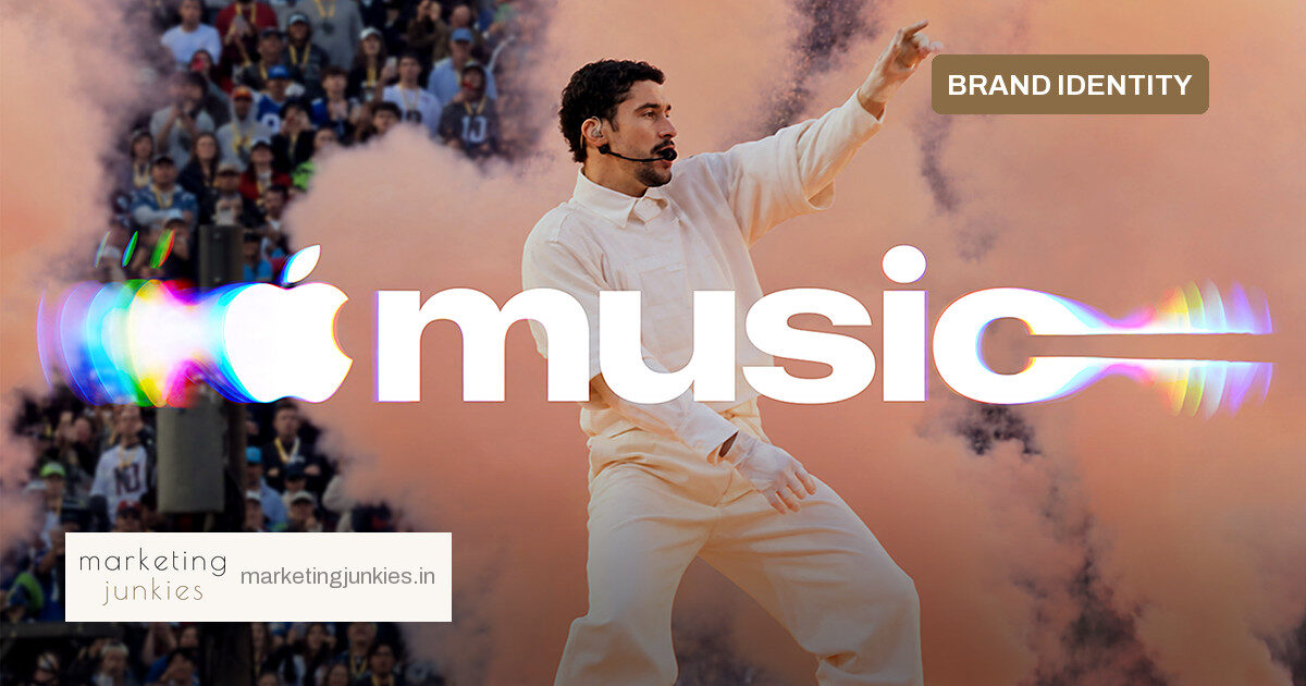
Apple Music has swapped a conventional logo refresh for a far more literal idea: its new brand identity is built from actual sound. The streaming platform revealed a rebrand created with TBWA\Media Arts Lab under the concept “made by sound,” anchored by a new audiovisual mnemonic.
How a transducer replaced the drawing board
Rather than beginning with type and colour studies, the team played music through a transducer—a device that converts an audio signal into physical vibration—set in a shallow bath of mineral oil. They filmed the ripples and waves produced on the surface. That footage became the raw material for the visual identity.
The wordmark pairs the Apple symbol with a custom version of SF Pro, Apple’s typeface, set in bold lowercase letters designed to convey the energy of music. The new look begins appearing across Apple Music original content and event programming this week, with out-of-home placements and a behind-the-scenes film that documents the process.
- A new audiovisual mnemonic created from sound waves filmed in mineral oil
- A custom SF Pro wordmark with the Apple symbol in bold lowercase
- Rollout across original content, events and out-of-home this week
Why this matters for marketers
Distinctive brand assets are more useful when they are difficult to imitate. Apple Music’s approach ties the visual identity to a physical process—one that requires the same equipment, setup and sound source to reproduce exactly. That gives the brand an ownable origin story, not just a new lockup.
The rebrand also unifies what users hear and see. A mnemonic is a short audiovisual signature, and Apple Music now has one grounded in the same creative idea as the wordmark. For brands refreshing an identity, that kind of coherence can be more valuable than a standalone logo.
The context around the rollout
The new logo was teased last month during marketing for Apple Music Hall, the brand’s new live entertainment venue in London. The full reveal arrives after some social media users criticised the minimalist black-and-white Apple Music app icon that landed with the iOS 27.2 update. A fresh identity with a documented making-of may help the company shift the conversation back to craft.
Separately, Puck reported earlier this week that Jay-Z is set to headline the Apple Music-sponsored Super Bowl 61 halftime show on Feb. 14, 2027, with Miley Cyrus and Justin Bieber also reportedly in the running. The NFL, Apple and Roc Nation have not confirmed the report. If it lands, the new brand system would be visible around one of the most-watched entertainment slots in the world.
What to do with this
The lesson is not to make every brand video a science experiment. It is to ask what physical property of a product can generate an asset competitors cannot easily copy. Then document the making: the behind-the-scenes film does the work of explaining the design without a long brand deck.
Source: Adweek