
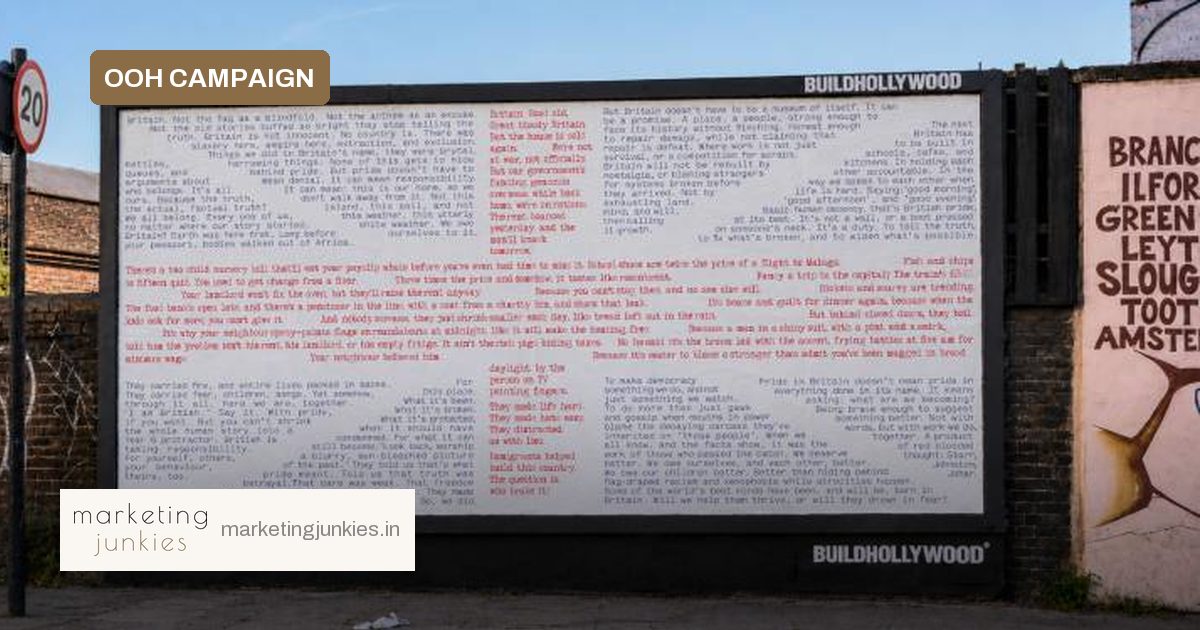
A year after a blunt poster asked what broke Britain, a new 48-sheet billboard is returning with a more forward-looking question: how does the country begin to fix itself? The Unbreak Britain Billboard, a sequel to the Broken Britain Billboard, will appear in Whitechapel during London Design Festival.
The work is credited to Elliott Starr, founder and creative partner at Belief Studio, working with David Johnston, CEO and executive creative director of Accept & Proceed, and Indy Johar, co-founder of Dark Matter Labs. It keeps the project in public space, but shifts the emotional register from diagnosis to repair.
From blame to shared responsibility
The original Broken Britain Billboard began as an anonymous public statement in Liverpool in September 2025. It questioned the causes of the cost-of-living crisis and the rise of far-right sentiment, pushing back on the tendency to blame immigrants and instead pointing to years of political mismanagement and misdirection.
The sequel goes further into difficult territory: empire, extraction, exclusion and policy failures. But the question has changed. Rather than only naming what is broken, it asks what might be rebuilt. One message on the artwork reads: “Britain doesn’t have to be a museum of itself. It can be a promise.” Another line makes the task immediate: “The next Britain has to be built in schools, cafes, and kitchens.”
Reclaiming a brand asset
Visually, the new work retains the original red typewriter-style text and introduces a second layer in blue. The two-colour treatment turns what was previously a St George’s Cross into a Union Jack. Johnston calls the flag “Britain’s most powerful brand asset” and says the project is an attempt to pull it back from division and exclusion. It is a designed dialogue, not a static symbol.
What marketers can take away
For marketing and media teams, the campaign is a contained case study in using cultural tension responsibly.
- Move beyond provocation: Negative framing earns attention, but unresolved anger can alienate. Pair critique with a concrete vision of what comes next.
- Treat symbols as living assets: The Union Jack is high-equity and high-tension. The work shows how colour, layering and typography can reframe an existing mark.
- Use context as part of the message: A 48-sheet placement in a specific neighbourhood during a design festival gives the idea a cultural stage that a digital-only execution would lack.
- Write for dialogue: The red-and-blue typewriter style makes conflicting perspectives visible, which feels conversational rather than preachy.
Why it matters
Starr says the first billboard was a “reality check”, while the latest aims to offer “a little more hope, and inspiration”. That arc—anger, recognition, repair—is useful for any long-running campaign built around social tension. It also shows that brand activism does not have to be empty; the work earns its position by naming specific failures and offering specific places where repair could happen.
Source: MediaNews4U